4.1. Plotting outputs in 2d: plots and histograms
GNA defines a set of convenience methods to plot the transformation outputs with matplotlib. The methods are wrappers for regular matplotlib commands. For the complete matplotlib documentation please refer the official site.
4.1.1. Plotting arrays
A plot(...) method is defined implementing
plot(y, …) call passing output contents as y.
The method works the same way for both arrays and histograms.
 1import gna.constructors as C
 2import numpy as np
 3from gna.bindings import common
 4
 5# Create numpy arrays for 1d and 2d cases
 6narray1 = np.arange(5, 10)
 7narray2 = np.arange(5, 20).reshape(5,3)
 8# Create Points instances
 9parray1 = C.Points(narray1)
10parray2 = C.Points(narray2)
11
12print('Data 1d:',   parray1.points.points.data())
13print('Data 2d:\n', parray2.points.points.data())
14
15from matplotlib import pyplot as plt
16fig = plt.figure()
17ax = plt.subplot( 111 )
18ax.minorticks_on()
19ax.grid()
20ax.set_xlabel( 'x label' )
21ax.set_ylabel( 'y label' )
22ax.set_title( 'Plot title' )
23
24parray1.points.points.plot('-o', label='plot 1d')
25parray2.points.points.plot('-s', label='columns of 2d')
26
27ax.legend(loc='upper left')
28
29plt.show()
When 1d array is passed (line 24) it is plotted as is while for 2d array (line 25) each column is plotted in separate. The latter produces the blue line on the following figure while the former produces orange, green and red lines.
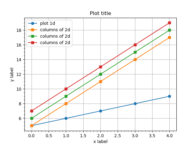
An example output.plot() method for outputs with 1d and 2d arrays.
transpose=True |
transpose array before plotting |
4.1.2. Plotting arrays vs other arrays
If X vs Y is desired output_y.plot_vs(output_x, ...) syntax may be used. Matplotlib
plot(x, y, …) function is used.
The twin method output_x.vs_plot(output_y, ...) may be used in case reversed order is desired.
 1import gna.constructors as C
 2import numpy as np
 3from gna.bindings import common
 4
 5# Create numpy arrays for 1d and 2d cases
 6narray_x = np.arange(5, 10)
 7narray_y = np.arange(0.13, 0.08, -0.01)
 8# Create Points instances
 9parray_x = C.Points(narray_x)
10parray_y = C.Points(narray_y)
11
12from matplotlib import pyplot as plt
13fig = plt.figure()
14ax = plt.subplot( 111 )
15ax.minorticks_on()
16ax.grid()
17ax.set_xlabel( 'x label' )
18ax.set_ylabel( 'y label' )
19ax.set_title( 'Plot title' )
20
21parray_y.points.points.plot_vs(parray_x.points.points, '-o', label='plot Y vs X')
22
23ax.legend(loc='upper right')
24
25plt.show()
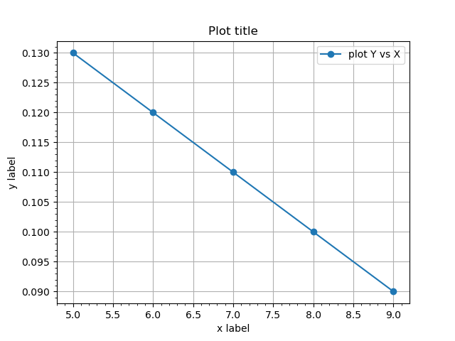
An example output_y.plot_vs(output_x) method for outputs.
transpose=True |
transpose arrays before plotting |
Note
The argument of plot_vs() and vs_plot() methods may be numpy array as well.
4.1.3. Plotting histograms
There are two options to plot 1d histograms provided. First one plot_hist() is producing regular line plot via
pyplot.plot(), the second one plot_bar() is
passing data to pyplot.bar(). See the example
below.
The plot_hist() has an extra option zero_value, which is by default 0. The options set the ground value for the
histogram that affects how the edges of first and last bins are plotted: they are drawn till the zero_value.
 1import gna.constructors as C
 2import numpy as np
 3from gna.bindings import common
 4from matplotlib import pyplot as plt
 5# Create numpy array for data points
 6nbins = 100
 7narray = np.arange(nbins)**2 * np.arange(nbins)[::-1]**2
 8# Create numpy array for bin edges
 9edges  = np.linspace(1.0, 40.0, nbins+1)
10
11# Create a histogram instance with data, stored in `narray`
12# and edges, stored in `edges`
13hist = C.Histogram(edges, narray)
14
15fig = plt.figure(figsize=(12, 5))
16ax = plt.subplot( 121 )
17ax.set_title( 'Plot title (left)' )
18ax.minorticks_on()
19ax.grid()
20ax.set_xlabel( 'x label' )
21ax.set_ylabel( 'y label' )
22plt.ticklabel_format(style='sci', axis='y', scilimits=(-2,2), useMathText=True)
23
24hist.hist.hist.plot_hist(label='histogram 1')
25
26ax.legend()
27
28ax = plt.subplot( 122 )
29ax.set_title( 'Plot title (right)' )
30ax.minorticks_on()
31ax.grid()
32ax.set_xlabel( 'x label' )
33ax.set_ylabel( 'y label' )
34plt.ticklabel_format(style='sci', axis='y', scilimits=(-2,2), useMathText=True)
35
36hist.hist.hist.plot_bar(label='histogram 1 (bar)', alpha=0.6)
37
38ax.legend()
39
40plt.show()
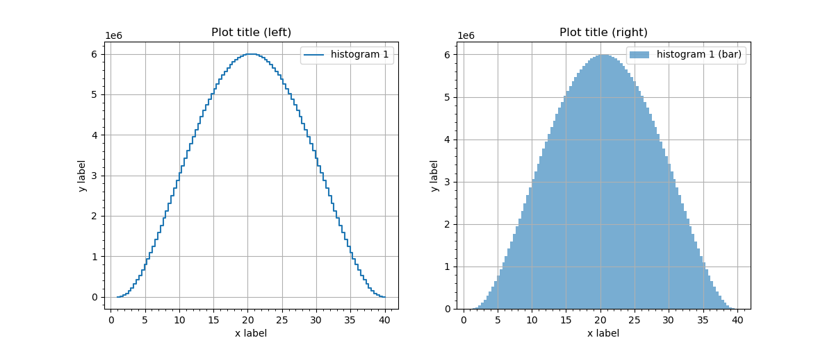
An example output.plot_hist() and output.plot_bar() methods for outputs.
zero_value=0.0 |
set the ground value of the histogram |
Histograms may be plotted with errorbar() method. See the file
04_hist_plot_errorbar.py
for example.
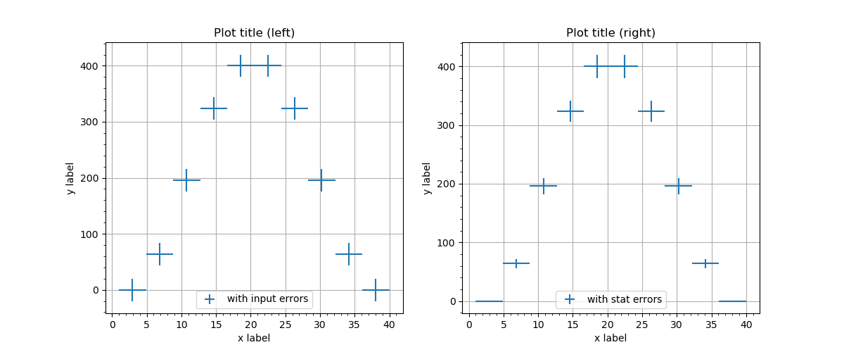
An example output.plot_errorbar() method for outputs.
4.1.4. Overlapping histograms
Both plotting methods may be used for plotting multiple histograms.
4.1.4.1. Line plots
Multiple plot_hist() are plotted as regular plots.
 1import gna.constructors as C
 2import numpy as np
 3from gna.bindings import common
 4from matplotlib import pyplot as plt
 5# Create numpy array for data points
 6nbins = 40
 7# Create numpy array for bin edges
 8edges  = np.linspace(1.0, 10.0, nbins+1)
 9narray1 = np.exp(edges[:-1])
10narray2 = np.flip(narray1)
11narray3 = narray1[-1]*np.exp(-0.5*(5.0-edges[:-1])**2/1.0)/(2*np.pi)**0.5
12
13# Create a histogram instance with data, stored in `narray`
14# and edges, stored in `edges`
15hist1 = C.Histogram(edges, narray1)
16hist2 = C.Histogram(edges, narray2)
17hist3 = C.Histogram(edges, narray3)
18
19fig = plt.figure()
20ax = plt.subplot( 111 )
21ax.set_title( 'Plot title (left)' )
22ax.minorticks_on()
23ax.grid()
24ax.set_xlabel( 'x label' )
25ax.set_ylabel( 'y label' )
26plt.ticklabel_format(style='sci', axis='y', scilimits=(-2,2), useMathText=True)
27
28hist1.hist.hist.plot_hist(label='exp(+)')
29hist2.hist.hist.plot_hist(label='exp(-)')
30hist3.hist.hist.plot_hist(label='gauss')
31
32ax.legend()
33
34plt.show()
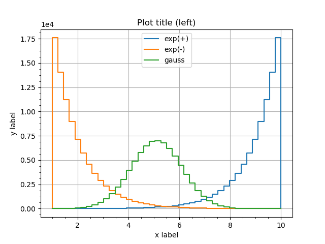
Several histograms superimposed in plot_hist() version.
For the bar version there are two ways to plot overlapping histograms.
4.1.4.2. Bars’ transparency
First one is to modify the histograms’ transparency by setting alpha option below 1.
 1fig = plt.figure()
 2ax = plt.subplot( 111 )
 3ax.set_title( 'Plot title (left)' )
 4ax.minorticks_on()
 5ax.grid()
 6ax.set_xlabel( 'x label' )
 7ax.set_ylabel( 'y label' )
 8plt.ticklabel_format(style='sci', axis='y', scilimits=(-2,2), useMathText=True)
 9
10hist1.hist.hist.plot_bar(label='exp(+)', alpha=0.4)
11hist2.hist.hist.plot_bar(label='exp(-)', alpha=0.4)
12hist3.hist.hist.plot_bar(label='gauss' , alpha=0.4)
13
14ax.legend()
15
16plt.show()
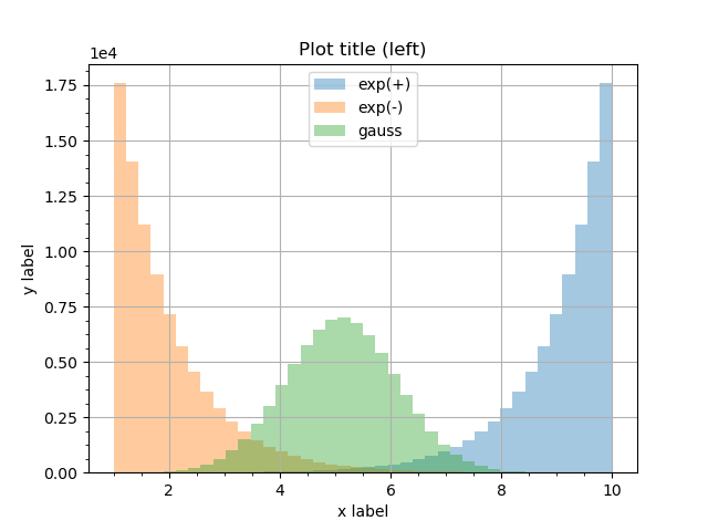
Several histograms superimposed in plot_bar() version with transparency.
4.1.4.3. Bars’ width
The second option is controlled by divide and shift options. divide is an integer factor dividing the bin
width. Setting divide=3 will shrink the bin width three times. The option shift defines where to plot the shrunk
bin within it’s old width: shift=0 shifts it to the left side, shift=1 to the center and shift=2 to the
right side. It is possible to plot overlapping histograms without bins actually overlapping.
 1fig = plt.figure()
 2ax = plt.subplot( 111 )
 3ax.set_title( 'Plot title (left)' )
 4ax.minorticks_on()
 5ax.grid()
 6ax.set_xlabel( 'x label' )
 7ax.set_ylabel( 'y label' )
 8plt.ticklabel_format(style='sci', axis='y', scilimits=(-2,2), useMathText=True)
 9
10hist1.hist.hist.plot_bar(label='exp(+)', divide=3, shift=0)
11hist2.hist.hist.plot_bar(label='exp(-)', divide=3, shift=1)
12hist3.hist.hist.plot_bar(label='gauss' , divide=3, shift=2)
13
14ax.legend()
15
16plt.show()
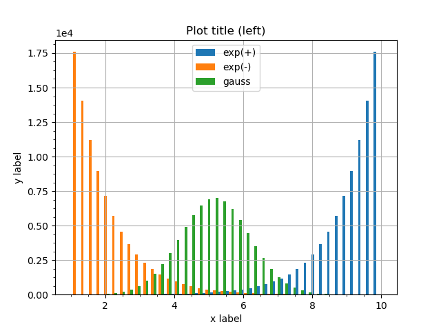
Several histograms superimposed in plot_bar() version with shrunk bins.
divide=N |
Divide each bin width by N |
shift=M |
Shift each bin by N widths (M<N) |